Friday, 30 October 2015

Creating Normal maps for a High Poly Crate


30/10/2015
Charlotte Bethany Henderson
100359031

Normal Maps

We were given a high poly and low poly version of the same model of a crate, and were told to create a normal map for it. This help to give the low poly crate the same detail level as the high poly version, while still saving on the poly count to help the game engine run smoother.
There are several ways to create normal maps, but I create one for the crate using xNormals, which entails exporting both the low poly and high poly versions of the crate as OBJs as well as exporting an 'Envelope' for the low poly, a way of giving the programme the basic idea of where to create the Normal map from.
There are all imported to xNormals, and then set to create a Normal map which gave me this normal map.

Normal Map from HP crate
As a side note, when I imported the Normal map into Maya, it didn't work correctly for no apparent reason, so the final renders are from Marmoset because they worked fine through that.
I also created an Ambient Occlusion map for the crate, which is a map of where the crate would be in shadow at all times regardless of lighting (mostly) which helps with creating depth as well as helping with developing the diffusion map.

AO Map from HP crate
After this I used Photoshop to create a texture for the crate, using a scratched metal texture as the paint, then hand painting colour detail over this and adding text.

Final Renders


Sunday, 25 October 2015

Low Poly Spellbook


20/10/2015
Charlotte Bethany Henderson
100359031

Since the 9th of October we have been working on modelling and texturing a low poly spellbook, using both Maya and Photoshop. 

I started off by modelling a relatively simple spellbook in Maya, making the shape curved and distorted to give the idea of it being an old, well used book. I also added a single clasp to hold the covers shut. I also did the uv mapping for the model and laid them out in a way that made the most of the uv space we had to use, making the cover larger that the rest of the pieces as this was the area that would have the most detail.


After ensuring that there were no issues with the model, I began to develop the texture for the spellbook, using the uv map put into photoshop as a guide.

I began blocking in solid colours for areas like the cover, finding suitable images that I could manipulate from Google, like leather textures and metal textures. Even if the basic image may not have been usable directly from Google, some could be cropped and rotated etc to fit into what they were needed for.

The first layer consisted a leather background for the cover of the book, which I had begun to create a worn look for using other leather images that I used the skills we learned in the photo manipulation section to merge into the base texture. I also added in a texture for the pages, by taking a section from an image that was found on Google and altering it to fit the section, by cropping it, then duplicating that area several times.

I then began looking at the clasps, and what I wanted them to be made from. I obviously knew that I wanted them to have a worn metal look, but which metal? I started off by looking at coppers, because I felt like it would match the overall colour scheme of the book so far, but once I had tested this on the model I decided that the copper texture both looked too polished to be on a worn clasp of an old book, and almost matched too well with the other colours in the texture so didn't stand out from the cover enough. 
After this I decided to go for a dark Iron colour for the clasp, and used several images from the internet manipulated together, as well as several colour layers in Photoshop to create a colour and texture that I was happy with. I had to bear in mind that the outside of the clasp would have been worn differently to the inside and apply materials accordingly. I decided that due to weathering the outside would probably be more rusted and dented than the inside, which would probably be quite smoothed down from the cover and pages rubbing on it over the years.

After I had all the areas blocked out in their general textures, I started to add finer details, such as type and designs on the cover, and locks etc on the clasp and adding more shadow to the pages where the cover would cast them.

Here I added detail to the spine where the Authors name and the title of the book would go, using the Marquee tool to select the area that I wanted to be enclosed and using the 'Stroke' tool to create the square box around the edge. This was then bevel embossed to create the look of it being printed onto the cover. This technique was used with all of the details on the cover as otherwise they look quite obviously overlayed which is not what I wanted.

I then began to add details such as patterns and text onto the cover to make it look like an ancient spellbook, in this layer I also added a lock to the clasp, as this actually gave the clasp a more relevant use to the book, rather than just having it as decoration.

This was quite an important layer as all these details are really what start to bring the book to life, making it look real, like something you would find in a Wizards Castle etc, otherwise it could just be any old book.


In the next layer I began to add more lighting to the book, adding shadows around the edges on the book cover where it would found around the book, and also on the areas of the pages that would be overshadowed by the lip of the cover.
I also added corner pieces to the cover in a similar shade of grey to the metal that I used for the clasp and text. The detailed part of the clasp I took from an image on Google, and then added parts using the Marquee tool to give the idea of it folding around the edge of the book. 

After this I simply added some more details to the cover, adding some corner details using the bevel emboss tool and images off Google, due to when I applied this texture to the model I felt like the back of the cover had a lot of blank space on it, that made it look poorly thought out. Also I added details to the clasp, as in the image on the left it looks as though the clasp is made out of one solid piece of metal, which makes no sense as to how it would work, so I added a hinge to the bottom of the clasp, as well as some rivets for how the clasp is fastened to the book. This was done using the Marquee tool and the bevel emboss effect.


I also created a bump map for this texture to apply to the book, which creates a more realistic look to the texture, making the dark areas look like indents and the lighter areas as raised sections.


Monday, 12 October 2015

Photo Manipulation


02/10/2015
Charlotte Bethany Henderson
100359031

This week we were taught how to create photo-realistic images in Photoshop, using Photo Manipulation. Our task was to turn an everyday alleyway, into one that has been rundown and ruined.

I started off with an image of a relatively average alleyway that was found on Google Images.


I started by applying block layers over objects in the picture that were too 'bright' and stood out too much from the background, to create an effect that looks like they'd been covered in dirt etc.

I did this over the bin and the boxes at the bottom left of the image, by using the marquee tool to select the area that I wanted to change, then filling that area using the bucket tool. On this layer I then turned the opacity down, so that you could still see the original object through the 'filter'. This layer was also set to 'Multiply' in the layer options.

After this I proceeded to start adding more to the image, by finding suitable images from Google and merging them into the original image that I was working from.
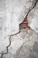
I chose to start by working cracks into both the floor and wall, to make it look as if the area was crumbling. This was done by adding the images as embedded images to separate layers, and manipulating them into position, then erasing any areas I didn't want to be included, turning down the opacity again, and changing the layers to the best layer option that suited them. (The crack in the floor on 'Darken' and the crack in the wall on 'Multiply'.)


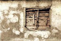
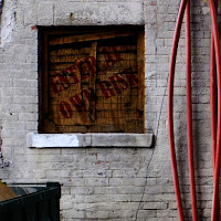
Then I added in images in place of the two areas where it looks like windows would fit, the one on the left having a layer added to make it look like its been boarded up in a more disorganized manner, like that on a condemned building, and the other having a layer added that includes broken shutters and rotting wood. These had to be lined up properly into the area that they were set into, otherwise they would look obviously edited in. Once again, opacity was turned down and both layers were set to 'Multiply'.


On top of the window on the left, I also added text, a 'Enter at Own Risk' sign, this was done by using a text box, which I used to insert and edit the text, which was then set to free transform, and manipulated into place. This layer was set to 'Multiply'.


After this I added in two graffiti tags using the same method as add in the cracks to the walls, turning down the opacity to make them look as if they were old and an attempt to remove them had been made. 'Multiply' was once again used, to allow the underlying brickwork to show through, making them look apart of the wall, rather than like they had been added onto the image later.

After this two final layers of a gradient map and a layer mask were added to bring all of the components together into a grungy looking alleyway.          


Comparison between Original image and Final image
                                                                

Sunday, 4 October 2015

Modelling a chess piece (Rook)


30/09/2015
Charlotte Bethany Henderson
Reference Image for Rook
100359031

During our first Introduction to 3D modelling lecture, we were assigned to practice our modelling skills by choosing an object and then recreating it in Maya. This was so that people that had either never modeled or had never used this particular programme before could get used to the tools that we will need to be using frequently during the course.

I chose to model a Rook, one of the pieces from a chess board, and started by finding an image that I could use to work from.

I then opened Maya and started working.

On my first attempt I began working from the base of the chess piece up, without giving much thought to how I was going to create the divisions at the top of the model. This caused me issues later on, and I ended up just creating a second model, rather than over complicating the original.

I started working from a primitive cylinder, which had 20 subdivisions on its two circular faces, which caused the issues later on, due to needing to have 24 subdivisions in order to have equal distances between the divisions at the top of the rook.

After having created the primitive cylinder I mostly used the extrude and bevel tools to create the ridges that run around the base of the chess piece, as well as the area just beneath the head of the rook.  I also used the 'Insert Edge Loop' tool to create three segments around the body of the rook in order to create the conical shape of this area.
First attempt  

It was at this point that I realised my error, and had to change my method of working.

After this I had to work instead from the top down, once again creating a primitive cylinder, but instead editing the presets so that it had 24 subdivisions on the circular faces, allowing for there to be an equal division by 6, (24/6=4) which meant that the head of the rook would have a pattern of 3 faces extruded, followed by one that was not, creating the divisions.

After this it was a simple matter of repeating the steps I had taken with the first model, just working from the top down, rather than from the bottom up.

Once I had completed the model I had to delete a number of the polygons that had been created, as while I had modeled it as a high poly model, as it was only a small object, the poly count should've been kept as low as possible. While close to the model this makes it look very squared off, at a distance it accounts for no lose of overall detail to the asset.
High/Low poly comparison

Completed model
Duplicated and textured